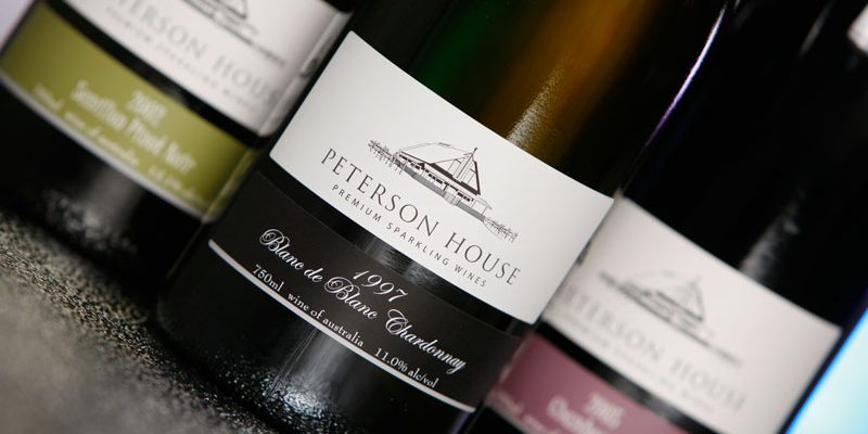
There is one certain thing under the sun. For
many excellent professionals dedicated to the design of wine and packaging
labels that exist in our country, as much as we advise that you do not leave
the design of your labels to low-skilled professionals, we know that many will
continue to do so.
Is a reality. Whether due to cost, lack of confidence or lack of importance, many winemakers continue to invest huge amounts in improving their production processes, and forget the enormous differentials that investing in Branding, good Marketing, or good design means for a brand.
And yes, the label of your wine is VERY important so that it sells more and better. You just need to discover this article from the Wine Design website that states that 80% of new wine consumers base their purchase on the label. Do you still think it is not important?
Therefore, today in our post we are going to expand a little more than usual, revealing in the following lines the arcana secrets that designers keep in lead trunks. We are going to tell you how to face the design of wine labels to achieve a good job (it is not really kept in a trunk ... but it loses the epic). Let's go there.
Know your consumers
Indeed, we start the list with a topic, but it is necessary. A bottle of wine leaves us a space for the front label of about 10 × 8 centimeters in the best of cases. A very small space so that we can include content for everyone. Therefore, we must be clear about what type of consumer will drink our wine.
Is one design better than the other? No, they are different. The magic of wine label design is to focus a single message on one type of user. Of course, Wine lovers of all kinds will drink as much one as the other, but we must think about our preferred audience when approaching design.
Colors and letters.
Before we begin, say that of course this is not an established rule. There are a thousand combinations and many work for one thing or another. The best advice we will give you is to focus the design of your labels on a mix between their personality and that of your brand. If you keep this, you will already have half done.
In any case, there are some colors that are usually related depending on whether the wine is white or red. Red wines usually carry warm colors, garnets, ocher or dark tones in general on their labels.
For whites, the use of blue or green colors, which convey much more freshness or the fruity character of the wine, is usually a topic that is followed regularly.
Again we tell you that the topics were created to be broken. The intention is always to make the central design stand out and thus enhance the personality of the wine.
Regarding the choice of the typeface, you should think that in a usual way, a typeface with serif will be related, in a general way, to a more classical concept than a “wooden” typeface. The more traditional wineries tend to use that stronger typeface, while the new winemakers tend to innovate more for finer typefaces.
The rear
This is a subject on which there is currently a heated debate. In most cases, 80% of the information on a back does not usually serve the newer consumer at all, but it can serve the more senior consumer. We like to complement the front design with a rear one in which we write a little story to accompany the wine, reducing the technical part to only what is necessary.
Finishes and materials
Another infinite thing is the type of paper and finishes for our label. At the very least, you should know that if the wine label is going to be in contact with water or ice, it is necessary to bet on a paper resistant to this element. In the choice of paper and finishes, the budget you have for printing will largely enter into, as your choice can multiply its cost by three.
In our case, we usually include production monitoring in our budgets and we go to the printer on the day of printing to ensure that the result is as expected. Still, there are always slips to deal with, and it pays to be prepared for the unexpected.
An important detail is to think about how you will label your bottles. In some cases, it is necessary to adapt the measurement to the roller of the labeller, or if the front and rear will go on the same roll or separately. As if the bottle is frustoconical, you must prepare the design of the label with the appropriate perspective so that it can be hooked without difficulty.


Comments
Post a Comment